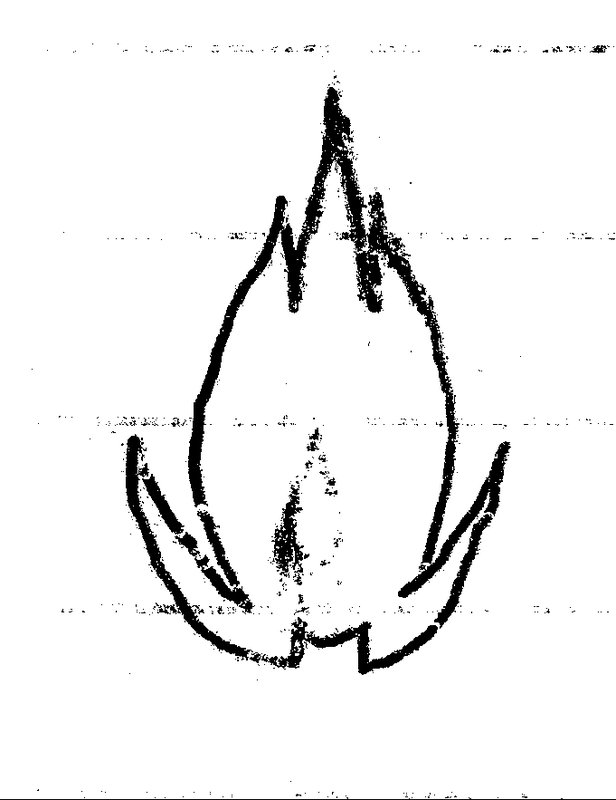
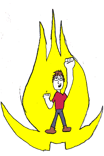
The first drawing I did of my emblem. It's not perfect, I feel it was a bit too ovoid as opposed to teardrop-shaped, and the pointy bits at the top are too short. Overall it's kind of thin.
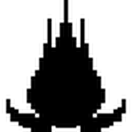
A pixelated version I created for a text character a while ago. It's definitely closer to the essence of the emblem. But of course, it's not perfect. For one thing, the pixelation makes the top all square and too thick, and the sides are too flat.
An earlier version of the one above. It's not as good. For one thing, the bottom points are too far out on the sides, though in the other one, they might be just a smidgen too close.
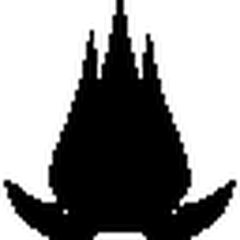
The result of using a vectorization tool on the previous one. it suffers a lot of the same problems as its source image, plus things like the sides are too flat, it's not round enough at the center, It does a lot of weird things with the bottom points (including but not limited to the rounding of the square part of them (unless you think that's better? Both could be interesting)), and the inside side of the outer top points should be completely flat.
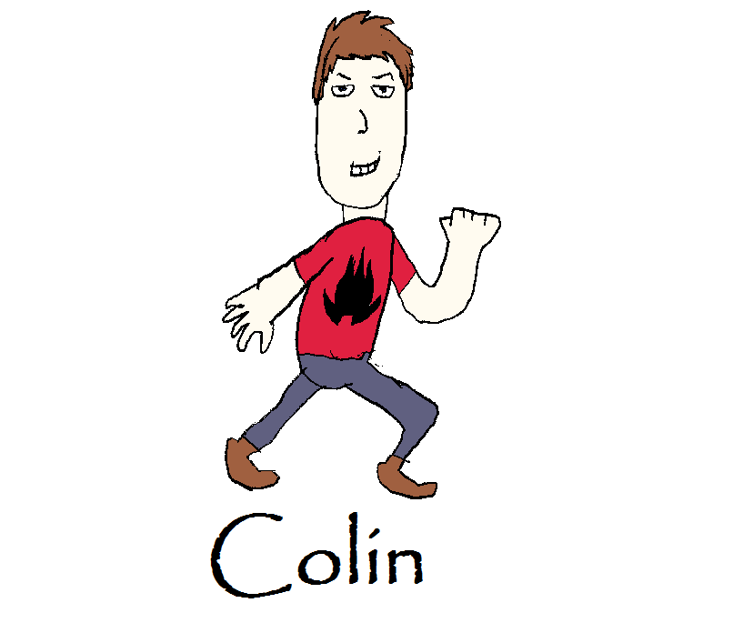
A drawing I did for a blog I have. You can see the emblem on my shirt. Again, it's not perfect.
Another drawing I did for my blog. You can see the points have gotten a bit wavy, and the proportions are all off.

